css властивість text-shadow
- Головна
- css
- властивості
- text-shadow
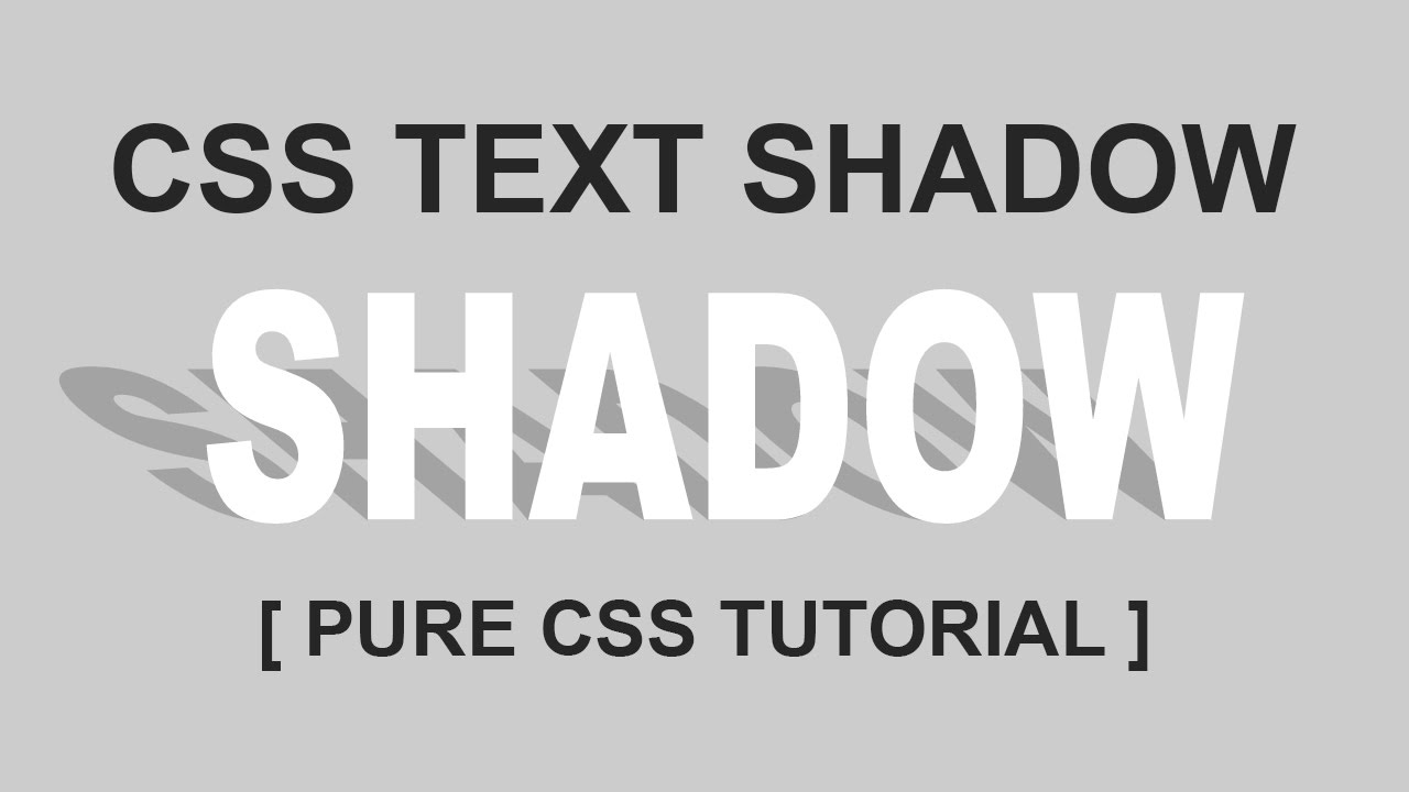
CSS властивість text-shadow додає тінь до тексту.
Властивість text-shadow приймає, такі, розділені пропусками, значенні:
- Зміщення тіні.
- Радіус розмиття тіні.
- Колір тіні.
Властивості text-shadow приймає список значень. Кожен елемент у списку може мати два, три або чотири значення.
Перші два значення — значення довжини, які визначають горизонтальне зміщення тіні та вертикальне зсув відповідно (це необхідні значення). Значення третьої довжини може бути визначено радіусом розмиття тіні (необов’язково). І значення кольору можна використовувати для визначення кольору тіні (необов’язково).
Ви можете застосувати кілька тіньових ефектів в рамках одного визначення властивості, розділяючи кожен набір значень комою. Кілька тіньових ефектів застосовуються в зазначеному порядку, і, таким чином, можуть накладатися один на одного, але вони ніколи не накладають сам текст.
Коли дано більше однієї тіні, тіні розташовуються спереду до спини (найперші ближче до користувача, наступні всі далі). Тобто перша задана тінь показується зверху.
Тіні тексту під текстом можуть відображатися, якщо він є частково прозорим. Також, тіні тексту не впливають на макет і не викликають прокручування чи збільшують розмір прокручуваної області.
Ця властивість стосується як псевдоелементів ::first-child, так і ::first-letter.
| Нотатка: | Послідовність задання параметрів заборонено порушувати. |
Синтаксис
text-shadow: h-shadow v-shadow blur-radius color|none|initial|inherit;
Властивість text-shadow може отримувати 7 значень:
noneТінь відсутня.
h-shadowОбов’язково.
 Зміщення тіні по горизонталі. Допускаються від’ємні значення.
v-shadowОбов’язково. Зміщення тіні по вертикалі. Допускаються від’ємні значення.
blur-radiusРадіус розмиття тіні.
colorКолір тіні.
initialВстановлює властивість у значення без задання.
inheritВказує на спадковість властивості від свого батьківського елемента (якщо відповідна властивість встановлена).
 Зміщення тіні по горизонталі. Допускаються від’ємні значення.
| Значення без задання: | none |
|---|---|
| Наслідує: | Так |
| Анімується: | Так |
| JavaScript синтаксис: | object.style.textShadow=»2px 5px 5px red» |
Переглядачі
- Стаціонарні переглядачі
- Мобільні переглядачі
| Переглядач | ||||||
|---|---|---|---|---|---|---|
| text-shadow | 2. | 10.0 | 3.5 | 1.1 | 9.5 | 12.0 |
 0
0| Переглядач | |||
|---|---|---|---|
| text-shadow | 2.1 | 1.0 | 1.2 |
Приклади
- Приклад 1
- Приклад 2
- Приклад 3
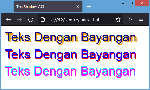
Наведіть на рядок тексту для того, щоб побачити тінь.
Приклад використання
Базова тінь для тексту
h2 {


  text-shadow: 2px 2px #ff0000;


}
Додаткові посилання
text-decoration-color
text-decoration
text-decoration-line
text-decoration-style
box-decoration-break
CSS: text shadows
CSS: text shadowsLanguages
See also the index of all tips.
On this page:
- Text shadows
- Fuzzy text shadows
- Readable white text
- Multiple shadows
- Outlines
- Neon glow
Text shadows
CSS level 3 has a property called ‘text-shadow’ to add a shadow to each letter of some text. In its simplest form, it looks something like this:
h4 {text-shadow: 0.1em 0.1em #333}
Which adds a dark gray (#333) shadow a little to the right (0.1em) and down (0.1em) relative to the normal text. The result looks like this:
The noak and the barcicle
Fuzzy text shadow
The simplest form of the ‘text-shadow’ property has two parts: a color (such as the #333 above) and an offset (0.1em 0.1em in the example above). This results in a sharp shadow at the indicated offset. But the offset can also be made fuzzy, resulting in a more or less blurred shadow.
The amount of fuzziness is given as another offset.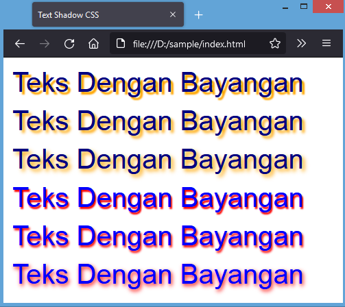 Here are two
lines, one with a little fuzziness (0.05em) and one with a lot
(0.2em):
Here are two
lines, one with a little fuzziness (0.05em) and one with a lot
(0.2em):
h4.a {text-shadow: 0.1em 0.1em 0.05em #333}
h4.b {text-shadow: 0.1em 0.1em 0.2em black}
“What do you say?” said the UK
In order to see more clearly
Readable white text
Shadows can make text more readable if the contrast between the foreground and the background is small. Here is an example of white text against a pale blue background, first without a shadow and then with:
h4 {color: white}
h4.a {color: white; text-shadow: black 0.1em 0.1em 0.2em}
Without shadow:
What is in it for me?
With shadow:
With a shovel and some oranges
Multiple shadows
You can also have more than one shadow. In general, that looks rather strange:
h4 {text-shadow: 0.2em 0.5em 0.1em #600,
      -0.3em 0.1em 0.1em #060,
      0.4em -0.3em 0.1em #006}
I wish wish wish…
But with two well-placed dark and light shadows, the effect can be useful:
h4. a {text-shadow: -1px -1px white, 1px 1px #333}
h4.b {text-shadow: 1px 1px white, -1px -1px #444}
a {text-shadow: -1px -1px white, 1px 1px #333}
h4.b {text-shadow: 1px 1px white, -1px -1px #444}
I, Augustus (you know who)
That’s extra, of course
This is a bit dangerous, as you can see if your browser doesn’t support ‘text-shadow’. In fact, the colors of the background and the text in this example are almost the same (#CCCCCC and #D1D1D1), so without the shadows, there is barely any contrast.
Drawing letters as outlines
The two-shadows example of the previous version can be taken even further. With four shadows, letters can be given an outline:
h4 {text-shadow: -1px 0 black, 0 1px black,
      1px 0 black, 0 -1px black}
Are you feeling red?
A cat, an apple, etcetera
It is not a perfect outline, and at this time (August 2005), the
discussion is still open whether CSS should have a separate
property (or perhaps a value for ‘text-decoration’) to make better
outlines.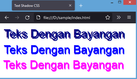
Neon glow
h4.a {text-shadow: 0 0 0.2em #8F7}
h4.b {text-shadow: 0 0 0.2em #F87, 0 0 0.2em #F87}
h4.c {text-shadow: 0 0 0.2em #87F, 0 0 0.2em #87F,
        0 0 0.2em #87F}
With a zest of best
There’s no no like a better no
Indeed, quite right, Mr M
Bert Bos, style activity leadCopyright © 1994–2021 W3C® Privacy policy
Created 4 August 2005;
Last updated Wed 06 Jan 2021 05:40:49 AM UTC
Languages
- Български
- Deutsch
- English
- Español
- Français
- Bahasa Indonesia
- Norsk
- Nederlands
- Polski
- Português
- Português brasileiro
- Русский
- ไทย
- Tagalog
- Українська
- Tiếng Việt
- 简体中文
- 繁體中文
About the translations
Тень текста | good-email-code
Последнее обновление:
CSS великолепен. Добавить тень текста очень просто
Поддержка text-shadow в электронной почте довольно хороша, но неполная, поэтому многие люди избегают ее использования.
Затем вчера в слабой группе EmailGeeks возник вопрос о поиске «уникальных решений» . Я не могу устоять перед таким языком, поэтому вот что я придумал.
Код
<ч2><дел > это мой заголовок
 Если вы не знаете разницы, ознакомьтесь с руководством W3School по блочным и встроенным элементам. Если вам нужно, чтобы он был встроенным, добавьте
 Текст переносится, когда он достигает края своего контейнера, поэтому добавление поля с одной стороны заставит теневой слой оборачиваться в немного другой точке, чем текстовый слой, когда мы сбалансируем их, тогда обтекание текстом будет соответствовать.
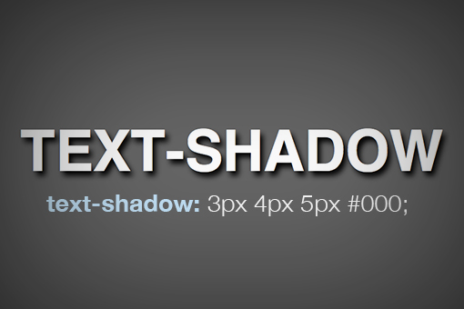
 Он также принимает отрицательные значения.