CSS: centering things
CSS: centering thingsLanguages
See also the index of all tips.
Centering things
A common task for CSS is to center text or images. In fact, there are three kinds of centering:
- Centering lines of text
- Centering a block of text or an image
- Centering a block or an image vertically
In recent implementations of CSS you can also use features from level 3, which allows centering absolutely positioned elements:
- Centering vertically in level 3
- Centering vertically and horizontally in level 3
- Centering in the viewport in level 3
Centering lines of text
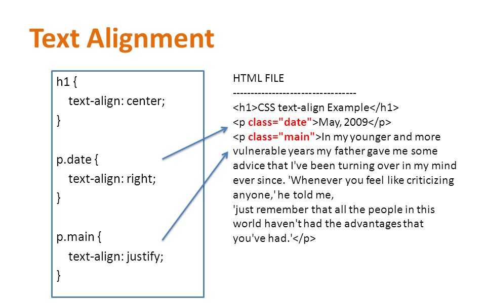
The most common and (therefore) easiest type of centering is that of lines of text in a paragraph or in a heading. CSS has the property ‘text-align’ for that:
P { text-align: center }
h3 { text-align: center }
renders each line in a P or in a h3 centered between its margins, like this:
The lines in this paragraph are all
centered between the paragraph’s margins, thanks to the value
‘center’ of the CSS property ‘text-align’.
Centering a block or image
Sometimes it is not the text that needs to be centered, but the block as a whole. Or, phrased differently: we want the left and right margin to be equal. The way to do that is to set the margins to ‘auto’. This is normally used with a block of fixed width, because if the block itself is flexible, it will simply take up all the available width. Here is an example:
P.blocktext {
    margin-left: auto;
    margin-right: auto;
    width: 8em
}
...
<P>This rather...
This rather narrow block of text is centered. Note that the lines inside the block are not centered (they are left-aligned), unlike in the earlier example.
This is also the way to center an image: make it into block of its own and apply the margin properties to it. For example:
IMG.displayed {
    display: block;
    margin-left: auto;
    margin-right: auto }
...
<IMG src="..." alt="...">
The following image is centered:
Centering vertically
CSS level 2 doesn’t have a property for centering things
vertically. There will probably be one in CSS level 3 (see below). But even in CSS2 you can center blocks vertically, by combining
a few properties. The trick is to specify that the outer block is
to be formatted as a table cell, because the contents of a table
cell
There will probably be one in CSS level 3 (see below). But even in CSS2 you can center blocks vertically, by combining
a few properties. The trick is to specify that the outer block is
to be formatted as a table cell, because the contents of a table
cell
The example below centers a paragraph inside a block that has a certain given height. A separate example shows a paragraph that is centered vertically in the browser window, because it is inside a block that is absolutely positioned and as tall as the window.
DIV.container {
    min-height: 10em;
    display: table-cell;
    vertical-align: middle }
...
<DIV>
  <P>This small paragraph...
</DIV>
This small paragraph is vertically centered.
Centering vertically in CSS level 3
CSS level 3 offers other possibilities. At this time (2014), a
good way to center blocks vertically without using absolute
positioning (which may cause overlapping text) is still under
discussion. But if you know that overlapping text will not be a
problem in your document, you can use the ‘transform’ property to
center an absolutely positioned element. For example:
But if you know that overlapping text will not be a
problem in your document, you can use the ‘transform’ property to
center an absolutely positioned element. For example:
This paragraph is vertically centered.
For a document that looks like this:
<div class=container3>
  <p>This paragraph…
</div>
the style sheet looks like this:
div.container3 {
   height: 10em;
   position: relative }              /* 1 */
div.container3 p {
   margin: 0;
   position: absolute;               /* 2 */
   top: 50%;                         /* 3 */
   transform: translate(0, -50%) }   /* 4 */
The essential rules are:
- Make the container relatively positioned, which declares it to be a container for absolutely positioned elements.
- Make the element itself absolutely positioned.
- Place it halfway down the container with ‘top: 50%’.

- Use a translation to move the element up by half its own height. (The ‘50%’ in ‘translate(0, -50%)’ refers to the height of the element itself.)
Recently (since about 2015), another technique has also become available in several CSS implementations. It is based on the new ‘flex’ keyword for the ‘display’ property. This keyword is meant for use in graphical user interfaces (GUIs), but nothing stops you from using it in a document, if the document happens to have the right structure.
This paragraph is vertically centered.
the style sheet looks like this:
div.container5 {
height: 10em;
display: flex;
align-items: center }
div.container5 p {
margin: 0 }Centering vertically and horizontally in CSS level 3
We can extend both methods to center horizontally and vertically at the same time.
A side-effect of making the paragraph absolutely positioned is that it is then only as wide as it needs to be (unless we give it an explicit width, of course). In the example below, that’s precisely what we want: We center a paragraph with just one word (“Centered!”), so the width of the paragraph should be exactly the width of that word.
Centered!
The yellow background is there to show that the paragraph is indeed only as wide as its contents. We assume the same mark-up as before:
<div class=container4>
  <p>Centered!
</div>
The style sheet is similar to the previous example with respect to the vertical centering. But we now move the element halfway across the container as well, with ‘left: 50%’, and at the same time move it leftwards by half its own width in the ‘translate’ transformation:
div.container4 {
height: 10em;
position: relative }
div.container4 p {
margin: 0;
background: yellow;
position: absolute;
top: 50%;
left: 50%;
margin-right: -50%;
transform: translate(-50%, -50%) }The next example below explains why the ‘margin-right: -50%’ is
needed.
When the CSS formatter supports ‘flex’, it’s even easier:
Centered!
with this style sheet:
div.container6 {
  height: 10em;
  display: flex;
  align-items: center;
  justify-content: center }
div.container6 p {
  margin: 0 }
i.e., the only addition is the ‘justify-content: center’. Just like ‘align-items’ determines the vertical alignment of the container’s contents, ‘justify-content’ determines the horizontal alignment. (It’s actually a bit more complex, as their names suggest, but in a simple case that’s how it works.) A side-effect of ‘flex’ is that the child element, the P in this case, is automatically made as small as possible.
Centering in the viewport in CSS level 3
The default container for absolutely positioned elements is the
viewport. (In case of a browser, that means the browser window). So
centering an element in the viewport is very simple. Here is a
complete example. (This example uses HTML5 syntax.)
<html>
<style>
body {
background: white }
section {
background: black;
color: white;
border-radius: 1em;
padding: 1em;
position: absolute;
top: 50%;
left: 50%;
margin-right: -50%;
transform: translate(-50%, -50%) }
</style>
<section>
<h2>Nicely centered</h2>
<p>This text block is vertically centered.
<p>Horizontally, too, if the window is wide enough.
</section>You can see the result in a separate document.
The ‘margin-right: -50%’ is needed to compensate the ‘left:
50%’. The ‘left’ rule reduces the available width for the element
by 50%. The renderer will thus try to make lines that are no longer
than half the width of the container. By saying that the right
margin of the element is further to the right by that same amount,
the maximum line length is again the same as the container’s width.
Try resizing the window: You’ll see that each sentence is on one line when the window is wide enough. Only when the window is too narrow for the whole sentence will the sentence be broken over several lines. When you remove the ‘margin-right: -50%’ and resize the window again, you’ll see that the sentences will be broken already when the window is still twice as wide as the text lines.
(Using ‘translate’ for centering in the viewport was first proposed by “Charlie” in an answer on Stack Overflow.)
Copyright © 1994–2021 W3C® Privacy policy
Created 5 May 2001;
Last updated Wed 06 Jan 2021 05:40:49 AM UTC
Languages
- Azərbaycan
- Български
- Deutsch
- Ελληνικά
- English
- Español
- Français
- Bahasa Indonesia
- 日本語
- Norsk
- Nederlands
- Polski
- Português
- Português brasileiro
- Русский
- ไทย
- Tagalog
- Українська
- Tiếng Việt
- 简体中文
- 繁體中文
About the translations
text-align — CSS — Дока
- Кратко
- Примеры
- Как пишется
- Подсказки
- Ещё пример
- На практике
- Алёна Батицкая советует
Кратко
Секция статьи «Кратко»text выравнивает текст по горизонтали внутри блока.
Если это свойство не задано, то текст выравнивается по левому краю.
Примеры
Секция статьи «Примеры»Ключевые слова:
p {  text-align: left;  text-align: start;  text-align: right;  text-align: end;  text-align: center;  text-align: justify;  text-align: justify-all;  text-align: start;  text-align: end;  text-align: match-parent;}
          p {
  text-align: left;
  text-align: start;
  text-align: right;
  text-align: end;
  text-align: center;
  text-align: justify;
  text-align: justify-all;
  text-align: start;
  text-align: end;
  text-align: match-parent;
}
Специальные значения для столбца в таблице:
p {  text-align: ".";  text-align: "." center;}
          p {
  text-align: ".";
  text-align: "." center;
}
Выравнивание блока (нестандартный синтаксис):
p {  text-align: -moz-center;  text-align: -webkit-center;}
          p {
  text-align: -moz-center;
  text-align: -webkit-center;
}
Как пишется
Секция статьи «Как пишется»У text есть четыре варианта значений:
center— выравнивание по центру.justify— выравнивание по ширине. Текст растягивается от левого до правого края, между словами появляются большие пробелы.left— выравнивание по левому краю (значение по умолчанию).right— выравнивание по правому краю.

Не так давно появилось ещё два крайне удобных значения:
start— текст выровнен по тому краю, по которому принято в текущем языке.end— текст выровнен по противоположному краю для текущего языка.
Формулировки сложные, но на самом деле всё просто. Если в русском мы читаем слева направо, то значение start будет выравнивать текст по левому краю, а end — по правому. Но в некоторых языках текст читается наоборот, справа налево. В этому случае start выровняет текст по правому краю, а end по левому. При этом вам ничего не нужно будет изменять. Значения сами подстроятся под текст. Достаточно изменить значение атрибута lang у тега <html>. Эти значения очень удобны, если вы разрабатываете мультиязычные сайты или приложения.
Подсказки
Секция статьи «Подсказки»💡 Значение свойства наследуется.
💡 Значение по умолчанию — left.
💡 Хотите отцентровать блок, не меняя выравнивание внутри него? Добавьте левый и правый отступ margin со значением auto: например, margin, margin, margin margin.
💡 Выравнивание текста нельзя анимировать при помощи transition ☹️
Ещё пример
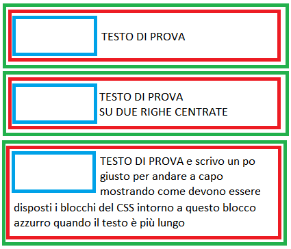
Секция статьи «Ещё пример»Вот сразу три варианта выравнивания текста внутри контейнера <div>. В этом примере мы задаём выравнивание в CSS-стилях, привязывая их к классам left, right, center, так что в HTML остаётся только добавить элементу атрибут класса с нужным именем, вроде class:
<div>  <div>Выравнивание по левому краю</div></div><div>  <div>Выравнивание по центру</div></div><div>  <div>Выравнивание по правому краю</div></div>
          <div>
  <div>Выравнивание по левому краю</div>
</div>
<div>
  <div>Выравнивание по центру</div>
</div>
<div>
  <div>Выравнивание по правому краю</div>
</div>
.Открыть демо в новой вкладке.left { text-align: left; } .right { text-align: right; } .center { text-align: center; } div { border: 1px solid; padding: 15px; } .content { /* Ширина вложенного контейнера */ width: 75%; }
 left { text-align: left;}.right { text-align: right;}.center { text-align: center;}div { border: 1px solid; padding: 15px;}.content { /* Ширина вложенного контейнера */ width: 75%;}
На практике
Секция статьи «На практике»Алёна Батицкая советует
Секция статьи «Алёна Батицкая советует»🛠 Свойство text можно использовать не только для выравнивания текста в строчных элементах, но и для выравнивания строчно-блочных (inline) элементов внутри родителя.
С появлением флексбоксов такое решение теряет свою популярность, но знать о нём стоит.
Простая разметка из родительского блока и трёх строчно-блочных вложенных элементов:
<div>  <div>1</div>  <div>2</div>  <div>3</div></div>
          <div>
  <div>1</div>
  <div>2</div>
  <div>3</div>
</div>
.Открыть демо в новой вкладке.parent { box-sizing: border-box; width: 80%; margin: 0 auto; padding: 25px; } .child { box-sizing: border-box; display: inline-block; /* Меняем отображение на строчно-блочное */ width: 125px; height: 125px; padding: 25px; text-align: center; /* Выравниваем текст внутри блоков */ font-size: 75px; line-height: 75px; font-weight: bold; }
 parent { box-sizing: border-box; width: 80%; margin: 0 auto; padding: 25px;}.child { box-sizing: border-box; display: inline-block; /* Меняем отображение на строчно-блочное */ width: 125px; height: 125px; padding: 25px; text-align: center; /* Выравниваем текст внутри блоков */ font-size: 75px; line-height: 75px; font-weight: bold;}
Добавим элементу text и элементы
А если попробовать распределить вложенные элементы равномерно по ширине родителя, задав text?
Ожидаемого поведения не получилось, и вот почему 👇
🛠 У значения justify хитрая логика. Чтобы можно было равномерно распределить элементы внутри родителя нужно задать этому самому родителю пустой строчно-блочный псевдоэлемент с шириной 100%.
.parent::after {  content: "";  display: inline-block;  width: 100%;}
          .parent::after {
  content: "";
  display: inline-block;
  width: 100%;
}
Открыть демо в новой вкладкеЕсли вы нашли ошибку, отправьте нам пул-реквест!
Во время отправки формы что-то пошло не так. Попробуйте ещё раз?
←
line
alt + ←
→
text
alt + →
Разбираемся с vertical-align — Веб-стандарты
«Опять vertical-align не работает!» — вздохнёт веб-разработчик.
CSS-свойство vertical-align — одно из тех, которые с виду очень просты, но могут вызвать вопросы у начинающих разработчиков. Я думаю, что даже у многих ветеранов CSS когда-то были проблемы с тем, чтобы его до конца понять.
В этой статье я постараюсь в понятной форме рассказать про это свойство.
Чего оно не делаетСкопировать ссылку
Распространенное заблуждение о vertical-align состоит в том, что применяясь к одному элементу, оно заставляет все элементы внутри него изменить свою вертикальную позицию. Например, когда элементу задан vertical-align: top, это подразумевает, что его содержимое поднимется к его же верхней границе.
Вспоминаются времена, когда мы делали раскладки на основе таблиц:
<td valign="top">
    Что-нибудь…
</td>
В данном примере с ячейкой таблицы использование свойства valign (в настоящее время исключенного из HTML5) приведёт к тому, что элементы внутри ячейки прижмутся к её верху. И естественно, когда верстальщики начинают использовать vertical-align, они думают, что получится то же самое, и содержимое элемента выровняется в соответствии со значением свойства.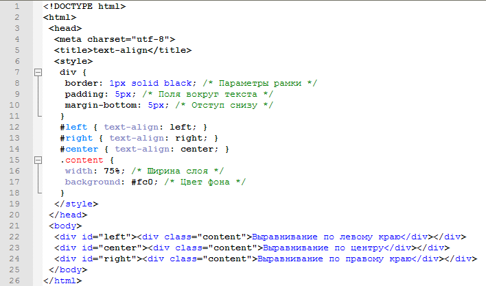
Но vertical-align работает не так.
Чем оно является на самом делеСкопировать ссылку
Использование свойства vertical-align может быть разбито на три простых для понимания правила:
- Оно применяется только к строчным элементам
inlineили строчным блокамinline-block. - Оно влияет на выравнивание самого элемента, а не его содержимого (кроме случаев, когда применяется к ячейкам таблицы).
- Когда оно применяется к ячейке таблицы, выравнивание влияет на содержимое ячейки, а не на неё саму.
Иными словами, следующий код не даст никакого эффекта:
div {
    vertical-align: middle; /* эта строка бесполезна */
}
Почему? Потому что <div> — это не строчный элемент и даже не строчный блок. Конечно, если вы сделаете его строчным или строчным блоком, то применение vertical-align даст желаемый эффект.
С другой стороны, при правильном применении (к строчному элементу или строчному блоку), свойство vertical-align заставит текущий элемент выровняться относительно других строчных элементов.
Выше или ниже расположится элемент, будет зависеть от высоты строчных элементов на этой же строке или от свойства line-height, заданного для неё.
Несколько картинокСкопировать ссылку
Вот картинка с пояснительным текстом, которая поможет вам понять, что происходит при вертикальном выравнивании строчных элементов:
А вот пример, в котором есть несколько строчных элементов, один из которых прижат к верху.
Ключевые словаСкопировать ссылку
Несколько ключевых слов, которые можно задавать в качестве значений для свойства vertical-align:
baseline, значение по умолчанию или «изначальное»bottommiddlesubsupertext-bottomtext-toptop
Возможно, многие из них вы не будете использовать, но было бы неплохо знать все имеющиеся варианты. Например, на демо-странице, из-за того что значение vertical-align для <input> установлено как top, он выровнен по самому высокому элементу в строке (большой картинке).
Однако если вы не хотите выравнивать элемент относительно картинок или других строчных элементов, обладающих блочными свойствами, вы можете выбрать значение text-top или text-bottom, тогда элементы будут выравниваться относительно текста в строке.
О ключевом слове
middleСкопировать ссылкуК сожалению, правило vertical-align: middle не выровняет строчный элемент по середине самого высокого элемента в строке (как вы, возможно, ожидали). Вместо этого значение middle заставит элемент выровняться по середине высоты гипотетической строчной буквы «x» (так же называемой x-height). Потому, мне кажется, что это значение на самом деле должно называться text-middle, чтобы стало понятно, какой будет результат.
Взгляните на пример, где я увеличил размер шрифта так, чтобы размер x-height стал гораздо больше. После этого станет понятно, что значение middle не получится использовать очень часто.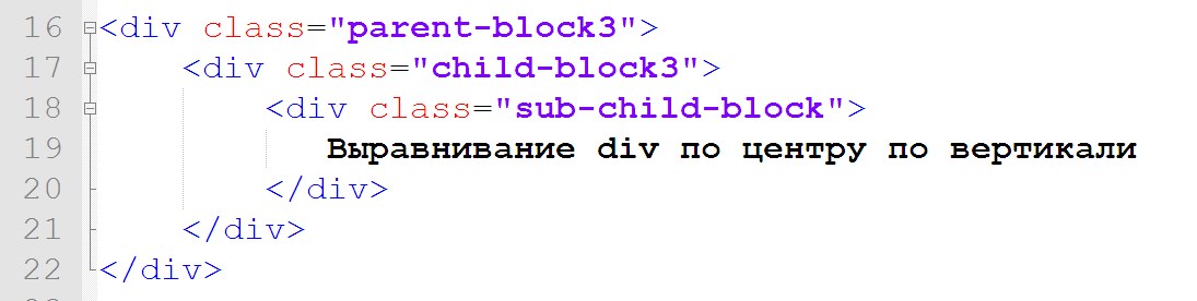
Числовые значенияСкопировать ссылку
Возможно, вы не знали о том, что vertical-align принимает числовые и процентные значения. Однако это так, и вот примеры их использования:
input {
    vertical-align: 100px;
}
span {
    vertical-align: 50%;
}
img {
    vertical-align: -300px;
}
Несмотря на то, что вы можете прочитать в спецификации раздел, описывающий, какие есть ключевые слова и значения, я думаю, гораздо полезней будет самостоятельно поиграть с ними и сравнить результаты.
ЗаключениеСкопировать ссылку
Если в одной фразе подводить итог о том, как использовать это традиционно неправильно понимаемое свойство, я бы сказал:
Свойство vertical-align работает только со строчными элементами или строчными блоками и ячейками таблицы. В случае применения не к ячейкам таблицы, оно действует на сам элемент, а не на его содержимое.
css — Как правильно выровнять элементы div?
Тело моего HTML-документа состоит из 3 элементов: кнопки, формы и холста. Я хочу, чтобы кнопка и форма были выровнены по правому краю, а холст оставался выровненным по левому краю. Проблема в том, что когда я пытаюсь выровнять первые два элемента, они больше не следуют друг за другом, а вместо этого располагаются рядом друг с другом по горизонтали? Вот код, который у меня есть до сих пор, я хочу, чтобы форма следовала сразу после кнопки справа без пробела между ними.
 #cЗадача {
  цвет фона: светло-зеленый;
}
#кнопка {
  положение: родственник;
  поплавок: справа;
}
#addEventForm {
  положение: родственник;
  поплавок: справа;
  граница: 2 пикселя сплошная #003B62;
  семейство шрифтов: verdana;
  цвет фона: #B5CFE0;
  отступ слева: 10px;
}
<голова>

<тело bgcolor="000" ТЕКСТ="FFFFFF">
  <дел>
    <тип кнопки="кнопка">
        Создать задачу


 child-div {
выравнивание текста: по центру;
фоновый цвет: голубой;
поле: авто 10px;
высота: 100 пикселей;
ширина: 50 пикселей;
}
child-div {
выравнивание текста: по центру;
фоновый цвет: голубой;
поле: авто 10px;
высота: 100 пикселей;
ширина: 50 пикселей;
}  Исходным порядком элементов будет порядок их отображения сверху вниз, поэтому я изменил их порядок.
 если есть 2 элемента (даже если один из них пустой), он поместит один слева и один справа.
 В настоящее время я работаю с кодом, показанным ниже, чтобы лучше понять flexbox.
HTML:
В настоящее время я работаю с кодом, показанным ниже, чтобы лучше понять flexbox.
HTML: Я хочу знать, как выровнять большой синеватый прямоугольник на фоне контейнеров справа или слева. По умолчанию он центрирован. Извините, если это было неясно в вопросе раньше.
 0">
0">

 Это окончательный результат :
 div-выравнивание {
ширина: 75%;
отступ: 40px 20px;
/* .... */
}
div-выравнивание {
ширина: 75%;
отступ: 40px 20px;
/* .... */
}